We Look Different!
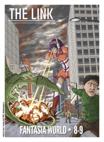
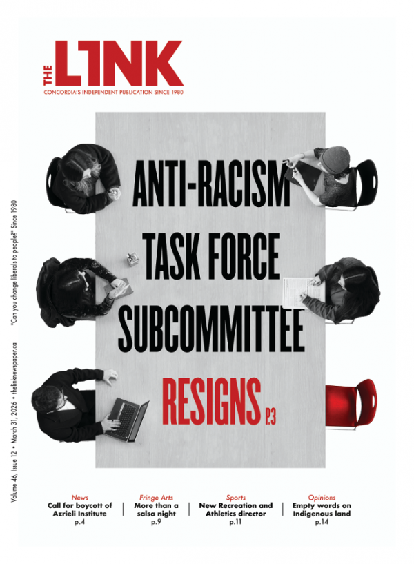
As you can probably tell from our excited tweets and the issue itself, we’ve just gone through part of our redesign at The Link. We’ve given the paper a new sleek feel; we have a new logo [which we’ll be rolling out on the rest of our web content soon], section heads and pagination.
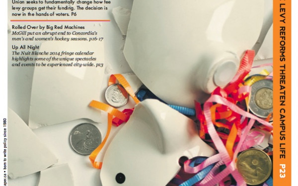
The new section heads give us a larger space to play around with our layout. Not having to worry about a big rectangle at the beginning of each section gives us more freedom for design.The old section heads often enough forced us into working with the same style. We can now pull our images to the top of the page, or we can use negative space more freely. From now on, we can make unique pages without disrupting the content or overall design.
The new paginations are still similar to our old ones, they’ve been simply rearranged to fit our new style—moved from the edge of the page to the middle.
Our logo, the symbol of our name, has been around for 5 years. Our new logo is how we hope to see The Link within the next 5 years: A newspaper that has the feel of a magazine. The font we used for the slogan is the same we use in our body text; it represents what we are and what we will always be, a newspaper. But with a website we can update daily, we’re aiming to have longer, feature-style content in print each week.
A newspaper with a magazine feel has been a concept we’ve been wrestling with ever since the online shift at the end of Volume 31. We’re going to tweak a few more things in our next issue (not major changes; small functionality changes like the visual styles we use in our written content).
We may have a new look, but we’re working under the same mandate: as an independent advocacy journal to serve Concordia and the greater Montreal community. Make sure you grab our first issue of Volume 33, and stay tuned for Issue 2 (and the resumption of weekly print issues) on stands August 28!
—Clement Liu
Creative Director

