New Year New Look At The Link
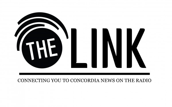
For The Link’s 36th anniversary, our masthead has agreed to give your beloved muckraker a new look. We racked our brains last year, trying to figure out ways to make our website more user-friendly, taking hints and borrowing tricks from popular news sites. Our Creative Director Laura Lalonde lent her unique style to create a minimalist logo that we hope will define us in this era of cool—recognizable yet abstract—widgets.
Let’s face it, our website was in dire need of an update.
Beside the new logo, we’ve added drop down menus so users can reach sections—especially blogs—a lot quicker than in the past.
Our photos are bigger. The homepage boasts articles complimented by visuals—something we think is crucial in this visual landscape that is the Internet.
But more importantly, The Link website is visually less cluttered than it was. Our welcomed readers can refresh the homepage to display a new top story.
Our outgoing Photo and Video Editor—he will be sorely missed—Brandon Johnston came up with a new sleek intro to adorn our videos this year.
No doubt, this year The Link is bringing something fresh to its readers. Stay tuned. This is only a start.
Even our office at H-649 got revamped. Come take a look.
Video by Brandon Johnston


_820_547_90.jpg)
2_640_640_90.jpg)
3_820_547_90.jpg)

