Out with the old, in with the new
The new age of cover art
The shift towards digital art and minimalist design is taking over the book cover scene. Authors, readers, and publishers alike have found that modern book covers look different than they did only a few years ago.
Young adult novels used to feature real people on the front, or detailed drawings. The industry is now seeing a trend of simpler designs. They are more design oriented and feature large fonts. Book covers tell very little about the story and every choice is made to attract the eye.
Megan Byers is the store manager for Babar Books in Pointe-Claire. The bookstore deals mostly with children and young adult literature.
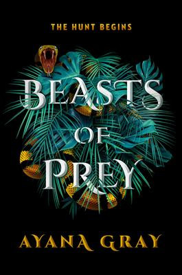
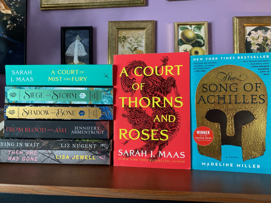
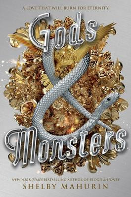
Byers said the books she currently finds the most popular usually feature a detailed image in the centre of the cover with text written over the image. Some examples that come to her mind include Beasts of Prey by Ayana Gray, where an image of foliage and a bright yellow snake take up the centre of the cover. She also mentioned the popular book Gods & Monsters by Shelby Mahurin, which also features a snake on the cover as well as bright gold images. She compared this style to that of less than five years ago, where many of the popular releases featured human subjects on the cover or detailed designs hinting at the book’s content.
However, the trends of cover art have very little to do with the selection of books carried at Byer’s bookstore. “We place our orders three to six months before a book is published,” said Byers. “Often, we won’t know what the final cover will look like before we order it. We go off [publishing representative] picks, summaries, and authors’ and publishers’ previous work,” said Byers.
Michaela Klint, a McGill student studying education in secondary English, has been an avid reader since the eight grade. While she tries not to let cover art influence her purchases, subconsciously, she finds eye-catching covers draw her to choose books she might not have otherwise looked at.
“Other than maybe one main symbol from the novel, covers are certainly lacking illustration in comparison to the books I was reading five to 10 years ago,” said Klint. “Any type of photography of real people or objects has essentially gone extinct.”
Read more: National Film Board presents free film collection for Black History Month
Klint collects books and said the shift has its perks as well as its downsides. She has noticed it is harder to differentiate the books she has already read since they look similar to each other. However, in her mind, the new art is aesthetically appealing. These choices then motivate her to buy certain books for the way they will look alongside her collection.
While she’s noticed the shift in debut authors, Klint has also perceived authors she has read in the past changing the way their books look. “Mary E. Pearson’s Dance of Thieves duology takes place in the same world as her original series The Remnant Chronicles. Yet, if you put her two series next to each other, the shift in cover art makes it look like they’d be released decades apart, instead of three to four years.”
Leila Marshy is the Associate Publisher of Montreal-based publishing house, Linda Leith Publishing. She believes this shift has originated from social media. “The cover needs to pop—you want people to share your cover on Facebook, Instagram, Twitter, TikTok. You want them to brag about it, talk about it, look at it, be intrigued by it,” said Marshy.
Marshy said the new shift is promoting covers that attract readers attention. Sticking to the same design concept can also allow authors to create a brand for themselves through their book’s cover art, she explained. “People can recognize the book even if they aren’t familiar with that title. Publishers want to do what will sell and attract attention. If they see a style taking off, they will want to try it,” said Marshy.
“The cover needs to pop. [...] You want them to brag about it, talk about it, look at it, be intrigued by it.” — Leila Marshy
Montreal-based company AOS Publishing’s Creative director Michael Occhionera is also an author who likes to have book covers eye-catching. “I wanted to have a piece of subject matter on the cover that represented the driving force of the novel, suggesting what could be found on the inside,” said Ochinorero. As he strives for aesthetically pleasing and bold covers, his latest novel features a bright hot pink colour.
Occhionero finds cover art isn’t pushing the envelope as much as it could be. Since literature is considered as a type of high art form, he wants cover art to reflect that type of expression—variety and exploration. “If you compare novels to album art or covers, there is a lot more variety and exploration,” said Occhionero.
“I have beautiful bookshelves that display my beautiful books,” Occhionero said. At AOS Publishing they put an emphasis on creating book art that will reflect the beauty within the novel, he explained.
Like every trend, it is unclear how long it will last but for now, it seems novels will be trying to seduce readers into buying them by any means necessary.