Concordia’s Branding Tainted by a Dead Man’s Horrific Past
Fed Up Design Students Take the Reins on a Project to Present a Rebranding to the University
Plastered behind Andrée Uranga was a Zen Den poster. A colourful 8 1/2 by 11-inch sign riddled with tranquillity-inducing leaves labelled, “Zen Den: Find Wellness On Campus.”
Trigger warning: This piece contains mentions of pedophilia, sexual abuse and incest.
To many, it is no different from other advertisements posted by the university on campus. To those with a keen eye for the history of typography and typefaces, it is poor visual communication.
Uranga pointed at the Zen Den poster behind him, “[Concordia is] promoting peace and quiet with the typeface of a rapist and an abuser.”
Uranga and Ankine Apardian, both passionate third-year design students and Concordia Design Art Student Alliance executives, are working to revive the organization, which had been dead for two years due to COVID.
One way they plan to rekindle DASA's once-burning flame is by implementing a rebranding project to replace Concordia's primary typeface: Gill Sans. "This whole thing has to be redone," said Apardian.
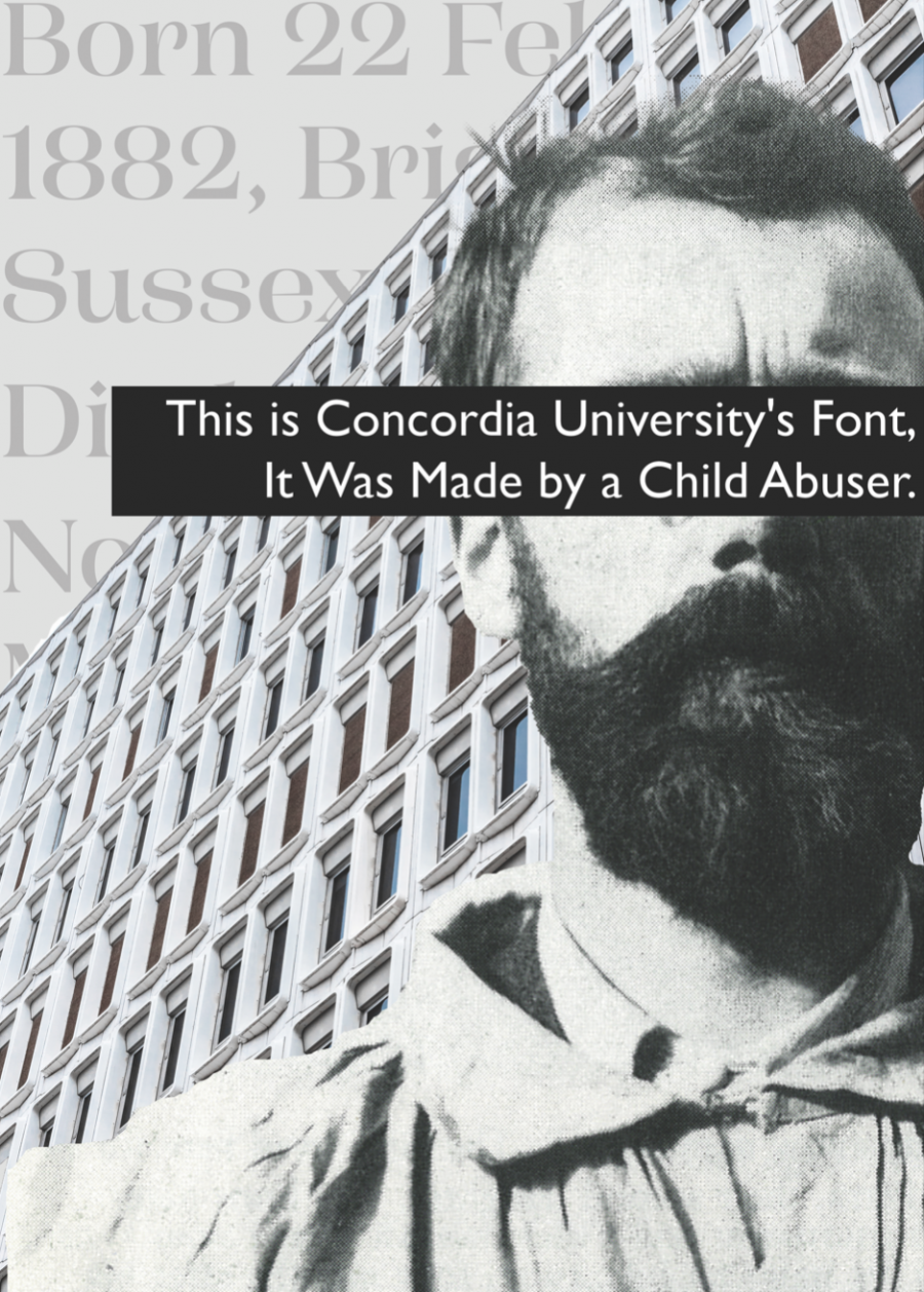
Gill Sans was created by Arthur Eric Rowton Gill in 1926. This prominent and notorious figure in the design and art world spent most of his years in the United Kingdom. He is known for his sculptures, drawings, typefaces and his involvement in the Arts and Crafts movement. He is also, however, remembered for the pedophilic sexual assaults on his two daughters, exposing himself to children, having incestuous relationships with his sisters and engaging in acts of bestiality.
In Fiona MacCarthy's biography “Eric Gill,” the bibliographer and cultural historian MacCarthy mentioned how Gill's obituaries labelled him as one of the "most influential figures of his period"
Yet, Gill's work was very sexually-driven and explicit. His most notable works were based on his nude daughters' and sisters' bodies. Gill's sculpture, Ecstasy, was designed after his sister Gladys, someone Gill had been having incestuous relations for most of his life. For this among many other reasons, Gill's work is considered controversial and unsettling to many.
The United Nations Educational, Scientific and Cultural Organization has recognized Montreal as a city that is thoughtful of design.
“In granting Montreal with this title, UNESCO is acknowledging the city's creative potential in the design disciplines, based on the strong concentration of talent here as well as the commitment and determination of the Ville de Montréal,” reads Design Montreal’s website design Montreal.
Apardian and Uranga do not understand how a university, rooted within an official UNESCO city of design, would not research the material they are using for their branding.
The use of Gill Sans as Concordia's typeface dates back to around 2006, after an effort to modernize their previous logo. Concordia representative Vannina Maestracci said the word “Concordia” is in its own custom typeface. Every other letter or symbol that the university uses falls into the Gill Sans font family. Concordia adapted this typeface after focus groups were conducted with students and alums.
The signs and posters around campus aren’t the only documents that utilize Gill Sans. All things published by Concordia are composed in Gill Sans, meaning territorial acknowledgements, apologies, mental health services and sexual violence policies are all examples of essential resources spoiled with Gill's touch.
"It would be surprising [if the university did not know], considering we are talking about an academic establishment. It would be strange if they didn't really research the material that they are putting into their branding," said Apardian about the university's knowledge of Gill Sans history.
However, at the time of the rebranding, Gill's disturbing past had already been made public for 17 years, after MacCarthy's biography blew up the public’s previous perception of Gill.
“There was no knowledge on our part of the history of the creator then, nor did it come up in conversations around this redesign. The typeface, a tool and technology to achieve communications goals, was chosen based only on visual expression,” stated Maestracci.
Alison Reiko Loader, a part-time professor that teaches critical visuality and design justice to third year design students, sits at a table answering questions and chatting alongside her colleagues: first-year part-time typography and visual communication Professor Pata Macedo and Philippa Langshaw, the department chair of design and computation arts, who teaches the second year environmental sustainability and collaboration course. Langshaw is speaking with us through the speaker of Loader's phone.
The design professors converse about how much time has elapsed without anyone recognizing the error—primarily given how long and tedious the branding process is.
“Clearly, they were not trained by design faculty,” Loader says of the designers who implemented Gill Sans at Concordia.
“Definitely not because they would have heard this,” added Macedo. “Because it is something that first years learn, it is not just Eric Gill, it is a part of their training where they learn about a history of a typeface,” added Loader.
Macedo thumbed through a thick book of typefaces and briefed the assignment she gives to first years. Her students are required to present the history of a typeface. She shows Blackletter, a font widely associated with the Nazi party, demonstrating how typefaces can hold associations and evoke emotions in those who see them.
“The point is, it is in our branding, even though it may seem insignificant and a small thing [...] It is still visual communication to the world.” — Alison Reiko Loader
DASA's plan to rebrand the university began when Macedo taught Apardian and Uranga. Macedo was and is very forward about the Gill Sans controversy. The first-year design students are taught to take design seriously as it is a service exchange for, in this case, a typeface representing a company. The passion for this project was instigated when they could see the same passion beaming through their teacher.
The rebranding initiative led by DASA is expected to surpass the duo's time at Concordia.
DASA plan is still in an embryonic state and is anticipated to take its time. As they are carefully building a case to explain and present to Concordia, starting with the typeface being terrible and why it is immoral. They also intend to give historical background and context about other rebranded organizations that ditched Gill Sans. Following their presentation, they will propose a rebranding project. Finally, DASA will not only request for the font to be dissolved by the university but will additionally provide alternative typefaces to replace Gill Sans.
Concordia would not be the first to replace the tainted typeface; the organization Save the Children and the television network BBC both modified their use of the typeface because they no longer wanted to be associated with a pedophile.
Uranga and Apardian hold this project dear to their heart as the two don't understand why a next-generation university would employ a typeface designed by a man who committed such vile acts. They believe that the font does not conform with the image Concordia is trying to communicate.
This next-generation image Concordia strives for is relayed through its posters sprinkled throughout campus, which highlight the nine-steps Concordia is taking in the direction towards being a next-generation university. Some steps are contradictory when Concordia chooses to persist with using Gill Sans.
“Double Our Research,” writes Concordia in the first of its nine-step plan, and “Embrace The City, Embrace The World: Achieve public impact through research and learning” in the seventh. Leaving hypocrisy to stick out like a sore thumb to teachers and students after the university’s lack of research into the origin of Gill Sans. The ninth and final step is “Take Pride: Celebrate successes and be purposeful about building a legacy.” Apardian stressed that using this typeface alone can be a telling legacy to design organizations as “someplace that has never heard of Concordia before. [There might be] a designer who has the type of eye for this kind of stuff, and notices that. There are immediate associations you make–it is not a nice association.”
“You walk down this hallway. You actually see the pillars of what it means to be a next-generation university. I don't think [Gill Sans] fits into any of those,” Uranga added. “It's everything but next-generation.”
Concordia has also adopted a “sustainability action plan” which includes long-term vision as well as five-year plans.”
With one of the focus points as part of this plan being research, Concordia is in a compromising situation when they decide to maintain a typeface, solely because of its visual components rather than surface-level information which can be uncovered with a single Google search.
"How can we be inclusive if we aren't going to be thoughtful about questions about what kind of design we use?” asked Loader. “It is right in our branding."
According to Uranga, Concordia cannot bear the sash of sustainability without factoring in all the rings that go into it. “You scrap the idea of social sustainability when you continue to use the typeface Gill Sans created by Eric Gill,” he said.
DASA is pushing to get Concordia to comprehend how unsustainable it is to keep a typeface braided into such controversy. Uranga explained that, when studying design, you are taught that design is not only about communicating through your work. Instead, it is about the vessel in which you communicate through. At Concordia, that vessel needs to be sustainable, emphasized Uranga.
Apardian notes that getting Concordia to ditch Gill Sans will be a tricky battle considering the debate around separating the art from the artist.
“[Eric Gill] was also a sculptor, and in that sense, he was a designer and an artist. And as designers, we always make sure to create a big distinction between art and design,” Apardian described. “We are not just creating for expression; we are creating to represent values, we are creating to represent people, and we are creating to represent an institution […] This is not a matter of being able to separate an artist from his art. It's about a design that we are sticking on the face of universities.”
Langshaw elaborated that typography is not something everyone understands and, typically no importance is placed on it.
Langshaw, Loader and Macedo avoid using the font whenever they can. All three of them have it blocked from their computers. Macedo turned down a job employing her to use the typeface because she refused to work with Gill Sans; she said she walked out happily too.
“It would be nice not to be embarrassed about a typeface with a history,” mentioned Macedo.
“You shouldn't have to turn down work because you [don't want to work with a typeface],” added Loader.
Loader remarked on DASA's rebranding idea, saying the university could start by acknowledging its wrongs and then gradually fizzle out the font's presence. “They can change their typeface on their website, on new things that are printed, like their every new magazine,” she said. “They can introduce other typefaces—because there is no reason why you can only use one.”
With all the hope DASA has for this project, Apardian and Uranga believe a rebranding would be a victory for the university, Concordia's design reputation and a victory for sustainability. Concordia can only benefit from this project, as it would further prove to faculty and students how willing they are to be a sustainable next-generation university.
“If we want to be contemporary, inclusive and work with diversity, then why not just switch?” Langshaw said. “It is not just the font itself—we are promoting a behaviour.”
This article originally appeared in Volume 43, Issue 7, published November 22, 2022.


_600_375_90_s_c1.jpg)