New era in the PWHL: Seattle Torrent and Vancouver Goldeneyes revealed
The Professional Women’s Hockey League has announced the team names and logos for its newest expansion franchises
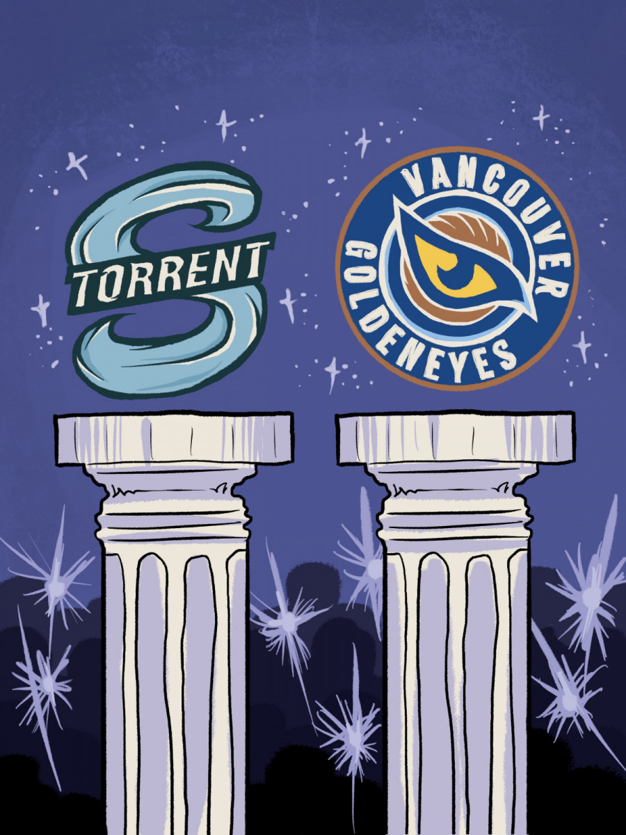
The Professional Women's Hockey League (PWHL) has unveiled nature-inspired branding for the league's new west coast additions, the Seattle Torrent and the Vancouver Goldeneyes.
Vancouver and Seattle’s new identities in the PWHL go beyond aesthetics; they carry deep meaning. Between the Goldeneyes’ wildlife symbolism and the Torrent’s aquatic imagery, the PWHL has delivered branding that balances creativity with strong regional identity.
"In both Vancouver and Seattle, nature is such an incredible presence," said Kanan Bhatt-Shah, PWHL VP of brand and marketing, in a press conference unveiling the branding. "Everywhere you look, all around you, it plays such a huge role in everyone's life, and that was something that we wanted to make sure we captured."
The Goldeneyes’ name stems from the goldeneye duck, a species found around the coastlines of Vancouver and much of British Columbia. The logo highlights a sharp golden eye surrounded by a wing angled upwards, pointing toward the Pacific Northwest. Its colour palette features Pacific blue, coastal cream and earthy bronze, with hints of sunset gold and sky blue, the team’s primary colours.
The Torrent nickname and S-shaped logo, with the word “Torrent” written across, reflect the powerful rivers and waterways of Washington. These natural features are central to the state’s identity. It is accompanied by its colour palette of foam, haze grey and basalt black.
Hilary Knight, the first captain in Seattle Torrent history, expressed her excitement to unveil the logo and identity to family and friends.
“Whenever you’re looking at the culture of a group, you want it to be a really strong room,” Knight said, “and to pair that with an incredible city with a storied sports legacy and a brand-new identity that speaks to all of that, it’s a great recipe for us.”
Branding and logos in sports bring identity to a team. Jennifer Gardiner, who was born and raised in Vancouver, reflected on the personality and representation behind the Goldeneyes logo.
“This identity is a perfect reflection of who we are and where we come from,” Gardiner said. “When I think of the Goldeneyes, I think of the landscape of British Columbia, the mountains, the ocean, and the grit that comes with growing up here.”
Creativity and branding in sports logos have grown beyond mascots and classic crests, especially in women’s hockey. Today’s designs lean into storytelling, symbolism, and regional elements to reflect a team’s identity beyond just its name.
Instead of relying on standard logo designs, teams use local artists and storytellers to blend local culture, geography and emotion into a team identity. The result: a new era of logos that are more expressive, meaningful and memorable, built to resonate with fans not only in jerseys but off the ice as well.
While merchandise featuring the new designs is available for sale, the new branding and logos will not be used on team jerseys for the 2025-26 season. Instead, teams will have jerseys with their city name.
The decision stems from the branding not being finalized in time for the PWHL to place jersey orders, as trademark checks and legal requirements can delay the process.
The PWHL’s third season officially starts on Nov. 21 with a doubleheader.
The Toronto Sceptres will take on the Minnesota Frost at Grand Casino Arena in Saint Paul, Minnesota, at 6:00 p.m. CST. Then, the Vancouver Goldeneyes and Seattle Torrent will go head-to-head at Pacific Coliseum in Vancouver at 7:00 p.m. PST, kicking off what promises to be a heated West Coast rivalry.
This article originally appeared in Volume 46, Issue 6, published November 18, 2025.