We Look Different: Online Edition!
Over the past few months we (mostly our awesome developer) have been working hard to enhance your experience with The Link online.
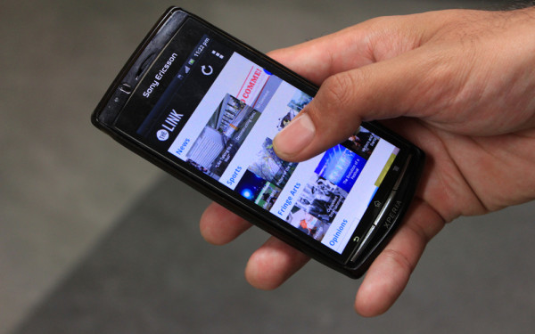
Last year we embarked on developing mobile apps, and now have both an Android and an iPhone app.
After some time we realized that while the apps are really cool and work well, not everyone wants to download an app. And if you’re reading from a link off Facebook or Twitter, you’ll be reading The Link on your mobile browser anyway.
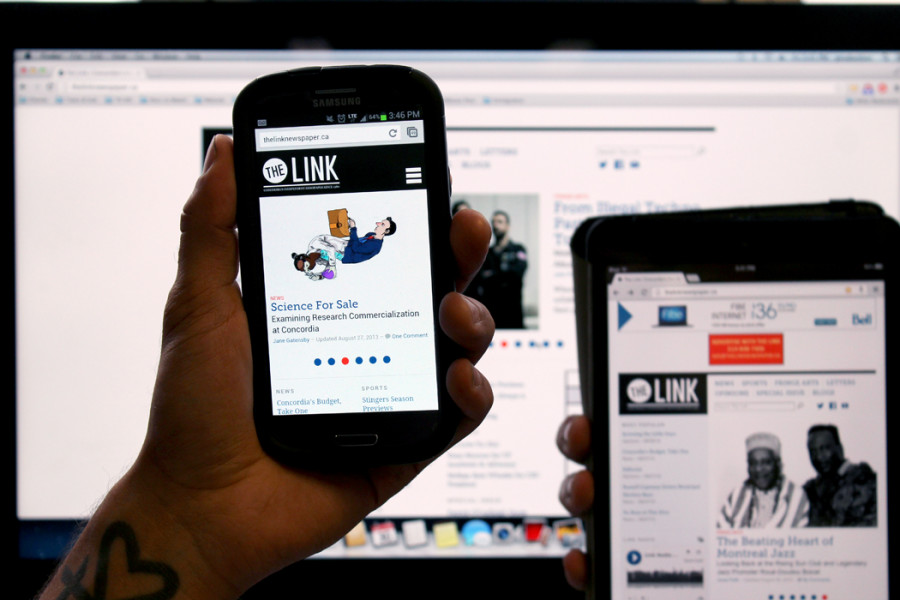
Enter our new website, responsive to your screen size.
For the last two years we’ve had a lightweight mobile site as a secondary option when a user connected to our website through a mobile device. The site was a bit clunky, and didn’t take advantage of everything smartphones and tablets are capable of these days.
For those who prefer to peruse from their desktop or laptop browser, our main website now features a wider page width overall, a touched-up home page, new widgets for our Link Radio and Fringe Calendar content, some more slight aesthetic changes, but, most importantly, a more responsive and intuitive interface.
Try it yourself! Resize your browser window as large or small as you want. The site will respond and adjust accordingly.
We really like the changes, and hope they work well for you.
Give it a shot and let us know what you think, right here in the comments section, or tweet at us.