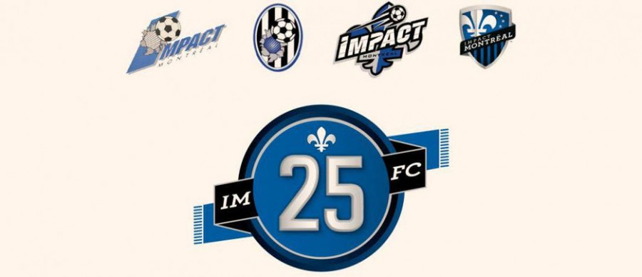
Impact rebrands to Club de Foot Montreal
Montreal soccer fans react to their clubs’s big change.
Soccer fans in the region of Montreal say good-bye to the Montreal Impact as the organization announced a change to the club’s name and logo.
The Impact were founded in 1992, taking over the city's soccer scene from the Montreal Supra. In 2012, the Impact became a member club of Major League Soccer, North America’s top soccer division. Nine years later, the organization have decided to rename their brand once more to Club de Foot Montreal, also known as CF Montreal or CFM.
“It’s a big change,” said Narek Chakhalyan, an avid CF Montreal fan.
“It’s weird to see CFM with a new logo on top of that,” said Chakhalyan. “However, I think the logo is unique and represents Montreal well. The ‘M’, the metro arrows which are unique to Montreal and the snowflake that represents diversity and the cold.”
Other fans disagreed with Chakhalyan’s view, however.
“I don’t like the ‘Club de Foot’ name because it sounds like an amateur club […] I don’t like the logo either,” said Tito, another CFM fan. “I do not find it aesthetically pleasing, it has a nice meaning behind it though as it is meant to identify francophones and anglophones as well as First Nations. Just the visual aspect is not to my taste.”
While branding is important, fans are generally more concerned with their club’s success on the field.
“I am a man of football. What I mean by that is that results on the field will impact what is going on off the field,” Tito said. “If we win games, if we are competitive and challenge for titles, no one will care what we are called.”
For some, a rebrand was simply unnecessary.
“The logo change is useless,” said Ugo Ciccone. “I understand the logic of the name change, to attract an international audience […] but I feel like our logo downgraded when it comes to how it looks and that it could have been done better.”
“I am attached to the now old logo, but I will eventually get used to the new one,” he mentioned.
Despite the mixed reaction received about the Montreal professional soccer team’s brand change, many fans are disappointed in how the change is experiencing tons of backlash.
“I’m disappointed in the reactions of many,” said Tito. “There have been some ethnocentric and ignorant comments that have no place in the sport.” The CFM fan is referring to comments he had seen on social media shortly after the new logo’s reveal: “Since the announcement of the new name and logo many are complaining that it does not represent French Quebec enough,” Tito said.
“A lot of people already had their minds set that they won’t like the rebrand, so it’s obvious that when you go into it with that attitude, it’s impossible to end up liking it,” added Chakhalyan. “I think everyone needs to take a step back and actually think about the change, and to not criticize just to criticize.”


_600_375_90_s_c1.jpg)
_600_375_90_s_c1.jpg)